
The original Lovesick logo recently discovered in an old note book while working on my professional work site. I wanted to include some original sketches of logos and brand design before they are fully realized for the website. That process of organic creation is a very important one for me as a designer and I think it brings a lot of extra value and a certain quality to the final product.
This particular logo started simply as a drawing, in a time of some emotional distress and upheaval. I had no idea or intention in starting this brand. It was only after I made this drawing and sort of stared at it for a few days, did I think there was something there conceptually to embark on this project - The Lovesick Club.
In the initial drawing, I just drew a classic serif font italicized that I felt went well with my pencil drawing of the melting heart emoji. Once I began to work on the design digitally, I started using the Caslon family of fonts for Lovesick. Font choice is often a feeling or a vibe that one gets for a particular brand or logo. Ultimately it just has to look good and more importantly feel good.
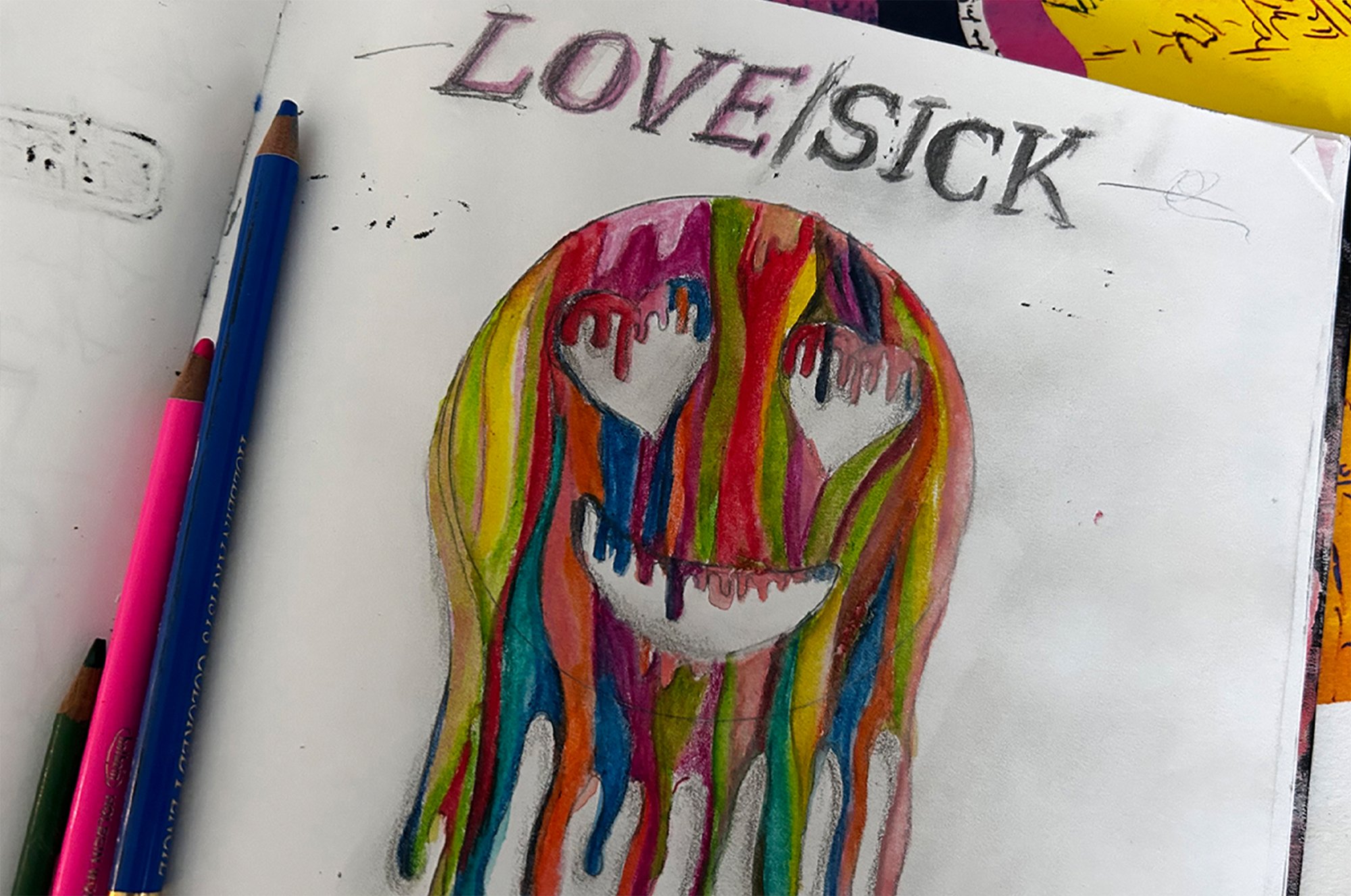
The original Lovesick logo drawn by hand with colour pencils

The Lovesick logo digitized v.1

The Lovesick logo in it’s most current form